Summary
I joined Fitbit in April 2019 to assist on our the January 2020 released (US and Canada) website redesign. I work with designers + developers to create scalable design solutions across all platforms that fit our new CMS, as well as designed webpages for our older website that is still live in the majority of the world. I constantly am designing pages and finding user friendly ways to present designs to stakeholders whether it be through InVision or Presentation Decks. Everyone should check out the new Fitbit.com and if you’re intrigued to see the old site still live check out this Fitbit.com.
Fitbit
Interactive/Visual Designer
April 2019 - April 2020
Before the Redesign
After the Redesign
The Challenge
Fitbit’s original website was created when the brand was created. It needed a user-friendly update to reflect the brand, increase product sales, site performance, and improve accessibility. The biggest issues for users were:
“Shop Now” CTA (buying a product) - Product pages were especially overloaded with information and with no clear “buy” button. Users were sent to another page - a store page - where users had to click “buy” a second time to even start the actual purchasing process. This wasn’t really the main goal of the actual product page - odd right?
Accessories Carousel - Like products, accessories had their own store pages, but only a store page. An Accessories Lookbook could be found almost at the bottom of the already extremely long product page. Most users didn’t make it all the way there, or were annoyed when they had to scroll through it and click ‘buy’ button for it to take them store page.
The Current Shop Now CTA
The Current Accessories Carousel
The Solution
New information architecture was created in order to simplify and consolidate the pages. From here, wireframes were created for the Homepage, Store Page, Product Pages, Accessories Pages, Cart & Checkout, Technology and Quiz pages to give Fitbit.com an easier shopping experience, which was the biggest opportunity to fix. However, initial templates created to implement an easy module design system needed many more tweaks after visual design elements were added and initial development work started, the templates were updated further to reflect development limitations and user needs.
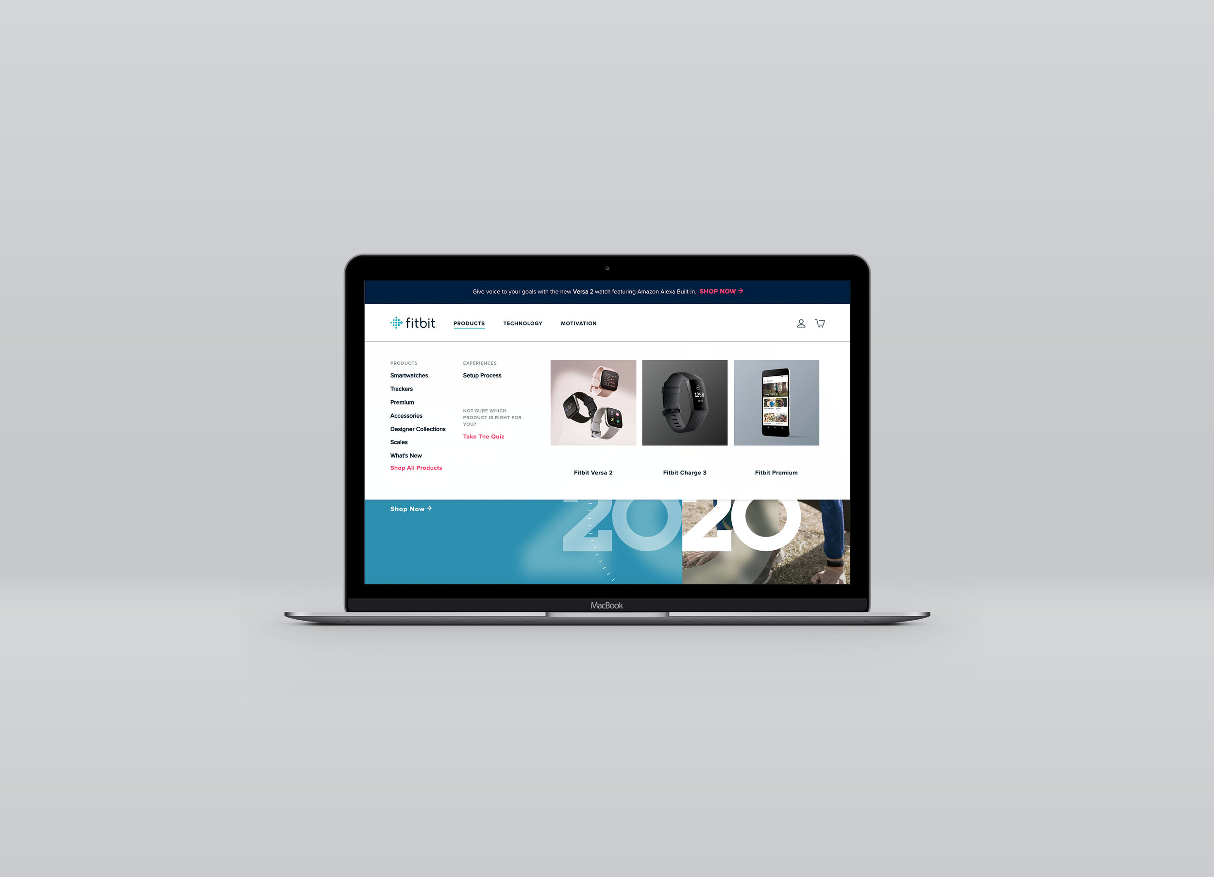
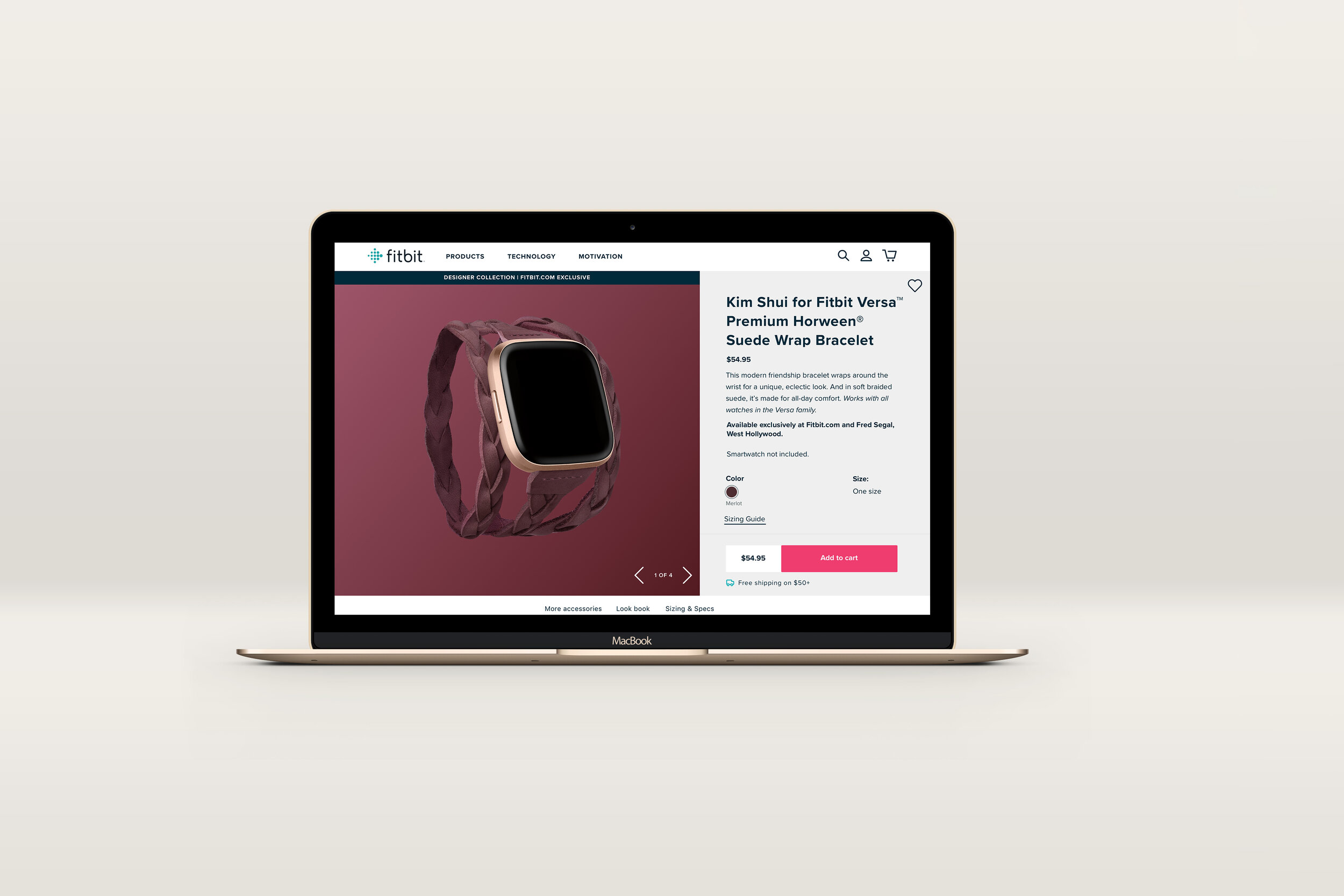
The New Product + Accessory Pages
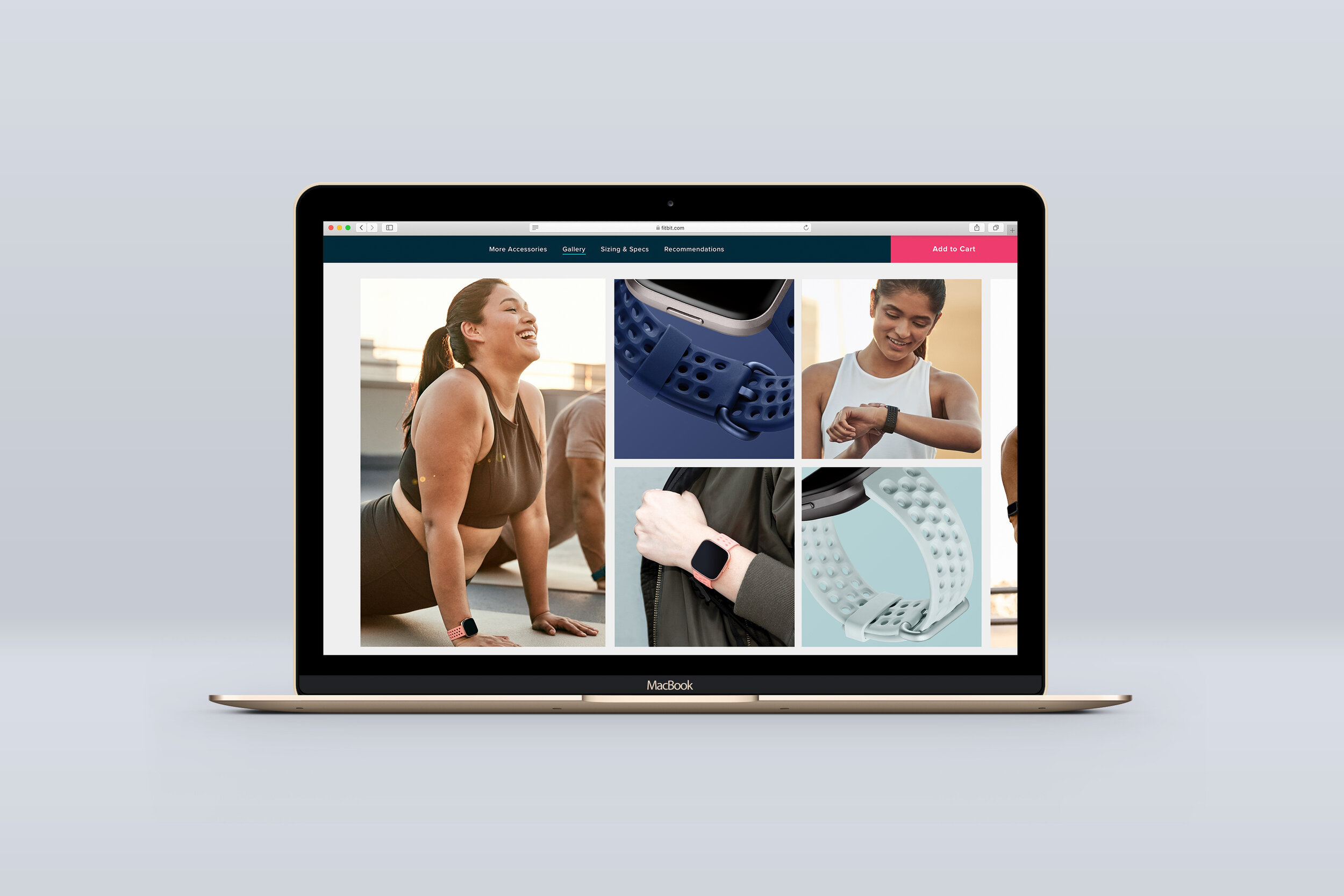
The New Accessories Carousel
Original
This old lookbook had at least 9 pages to scroll through, but depending on the product, it could have closer to 20. It was at thee bottom of the page and then an ordeal to scroll through after scrolling through the long page.
Current
While we were lucky to launch the new Fitbit.com in the U.S. and Canada, the rest of the world had to see this old site. I was able to talk developers into building the best version of the new lookbook on our legacy site, until the new site launched everywhere. The new site is almost completely launched everywhere, so this current will transform to its CMS (almost identical) version.
New + Needs Fixed: The Lookbook
Original
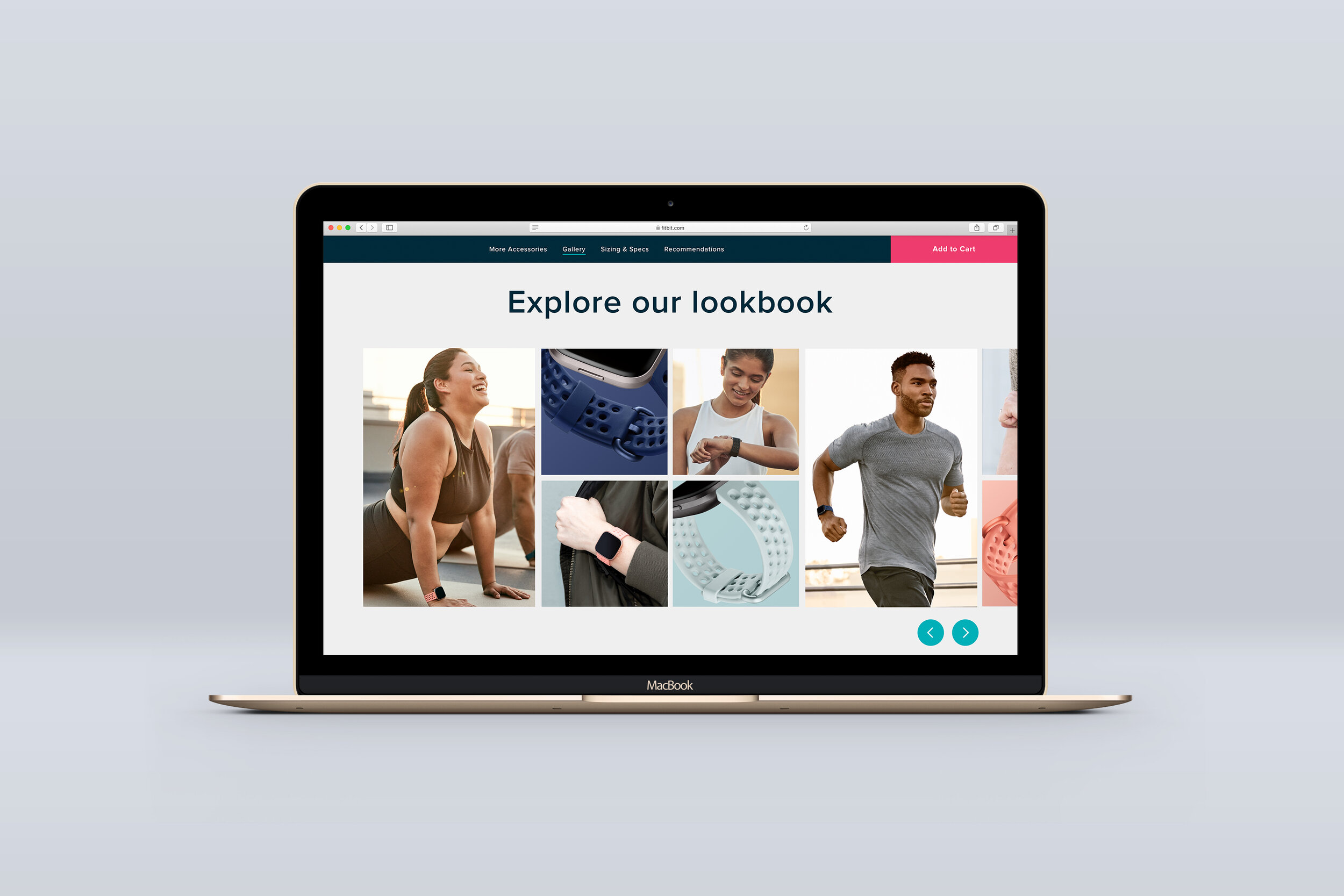
As part of our new website launch, we condensed a large accessories carousel into a 5- 10 image lookbook. However, at 1440px the module as a whole isn’t fully visible and users couldn’t tell what to do.
Current
We redesigned it to where the 1st 5 images are now visible. This way if there are only 5, a user sees them at all once, and if there are more they can see the image peeking in.
Future
While we did minimal changes to make the experience better for what is currently live on the site. In another reiteration, it would be great to have the entire module above the fold so users can see the headline, images, and arrows for scrolling. Though, to implement this, development would have to build a different module for scenarios when the lookbook has only 5 images and it isn’t scrollable. Also, the developers have not turned off gradients for accessories lookbooks, where links are not listed.
Other projects


