Summary
When Mindswarms was working on a redesign of their website, they asked me for a little art direction for their resources section and a UX check.
Mindswarms
Visual Design
Before
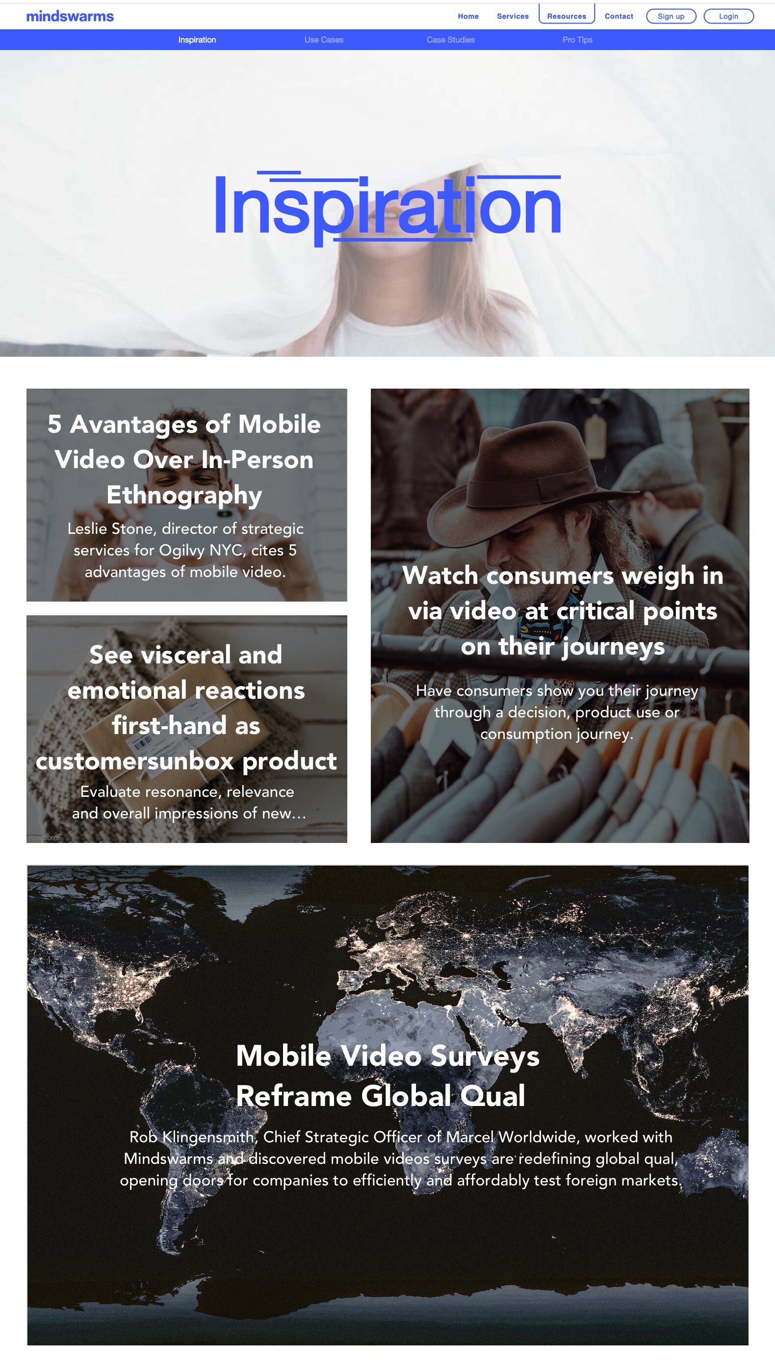
This is what Mindswarms looked like after I chose imagery for their site, but some of the UX wasn’t quite right.
The nav bar has a lot of hollow shapes, making it confusing to know what is selected versus or if some items are even clickable.
The content is below the fold, so the header image doesn’t need to be so large.
Headlines and subheadlines completely cover images, which just takes away from the interesting visuals.
Gradients or overlays across multiple pages were inconsistent, which allowed for even this large of text to be illegible.
After
This is what Mindswarms looked like once I chose images for their site and suggested UX tweaks!
I changed the nav bar to have which section a user is currently on to be highlighted in Purple with the type change to white. To make the CTA more obvious, I also changed the “Sign Up” button to be solid purple with white type.
I changed the hero image to be smaller so users could see the content starting above the fold to realize there was valuable content on the page.
Headlines and subheadlines have been made smaller and moved to the bottom left corner of the image. I also recommended that subheadlines are only 2 lines.
All images have consistent gradients to accommodate text and make sure its legible.


