Summary
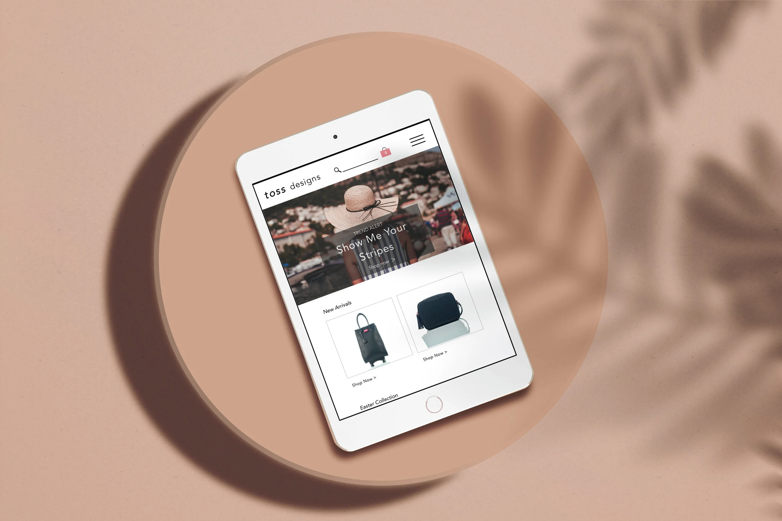
Toss Designs was started in the San Francisco Bay Area, but has recently branched out by opening stores in Atlanta, GA and Charleston, SC. Toss has branded itself as a design house primarily for bags and all of the accessories in between. Shoppers in store have a very different experience than online. This two week solo project focused on creating a responsive redesign of their website with new information architecture that met Toss shopper's’ expectations, an “add a monogram” feature, and a new updated logo.
Toss Designs
UX/UI Designer | Researcher
April 2018
The Challenge
Users find Toss’s website difficult to use because the products aren't organized in a way that customers can find, and the monogramming options are not as extensive online as in store.
The Solution
Update Toss Designs' website by creating a new navigation bar that resonates with shoppers, reorganize the products into category pages that meet Toss shopper expectations, and create an option to add a monogram to items.
The Process
What I did
Market Research
User Research
Usability Testing
User Experience
User Flows
Card Sorts
What tools I used
Pen & Paper
Sketch
Invision
Adobe Photoshop
What I delivered
Competitive Analysis
Research-Driven Personas
Interactive Prototype
Wireframes
Mockups
Toss: Before the Redesign
Homepage
Users did not realize the header image was just 1 big box to click.
Users did not know why the navigation bar had so many options and why it took up 2 lines.
Product Page: Lexi Cosmetic Bag
There is no way for the user to add a monogram (to any product), even though this product is under the "Monogram" section.
Users were also confused about which section they were in because this page did not have any breadcrumbs.
Category Page: Travel Bags
There was only 1 product on this category page, which was confusing for users and goes against best e-commerce practices.
Users also expected to see luggage or larger tote bags under a travel section.
Meet the Shoppers
The Bride
Located in New York, NY
Currently in an MBA program
Recently Engaged
Needs gifts for her bridesmaids' swag bags
The Busy Mom
Located in Marin, CA
Busy Mom of 2
Needs a way to buy the monogrammed items online, whens he does not have time to stop at a Toss storefront
The Matriarch
Located in Nantucket, MA
Mom of 3 daughters, Grandmother of 7 girls
Loves Toss because she can buy her family matching/ monogrammed items
Needs better navigation because she is not sure how to find what she is looking for
Toss + its Competition
A Competitive Analysis was completed to see which big name brands appeal to Toss’s user base and see if Toss's website holds up to best e-commerce practices.
Toss Designs
Currently has a small, but loyal customer base, ranging from ages 18-62
Is not a legacy brand because it is newer to the market and there is no “face” to the brand, unlike its competitors
Monogram items are the most popular in store, but is not an option online- there is no way to add a monogram to any of the products on the site
Does have original designs, just like its other major brand name competitors
Lilly Pulitzer
Loyal Customer Base
Offers a variety of clothes & accessories for the whole family, not just women
Lifestyle brand, not just clothing
Ability to add a monogram to products
Vineyard Vines
Legacy Brand for women
Loyal Customer Base
Customer ages range, but primarily has a Millennial consumer base
Lifestyle brand, not just clothing
Mark + Graham
Part of the Williams-Sonoma family
Has a little bit of everything
Majority of items are customizable
Ability to add a monogram to products
Information Architecture
Used Best E-Commerce Practices, Competitive Analysis, and Card Sorting Activities to create a new sitemap for Toss's website.
"Shop by Collection" was a category page on the original site, but has been removed from the new site navigation because users found the collection names confusing, not all collections had an intuitive name
"Gifts" has been added as a category page because Toss has dozens of products that users do not think belong where they are currently placed
"Monogram Shop" has been added as a category page so that in-store experience is translated to the online experience
User Flows
User flows were created to help better understand how a shopper would navigate Toss's new site. The flows below show how a user adds a monogram to an item and what the checkout process is like.
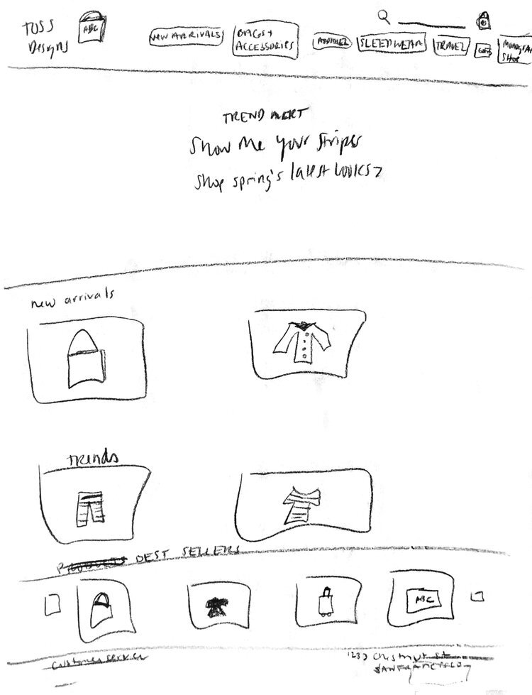
Initial Sketches
These pages were drawn in a 15 minute time box activity. The new information architecture was used for the navigation bar, E-Commerce Practices were in mind, and competitors' sites were taken in consideration when putting these together.
Homepage
Category Page
Product Page
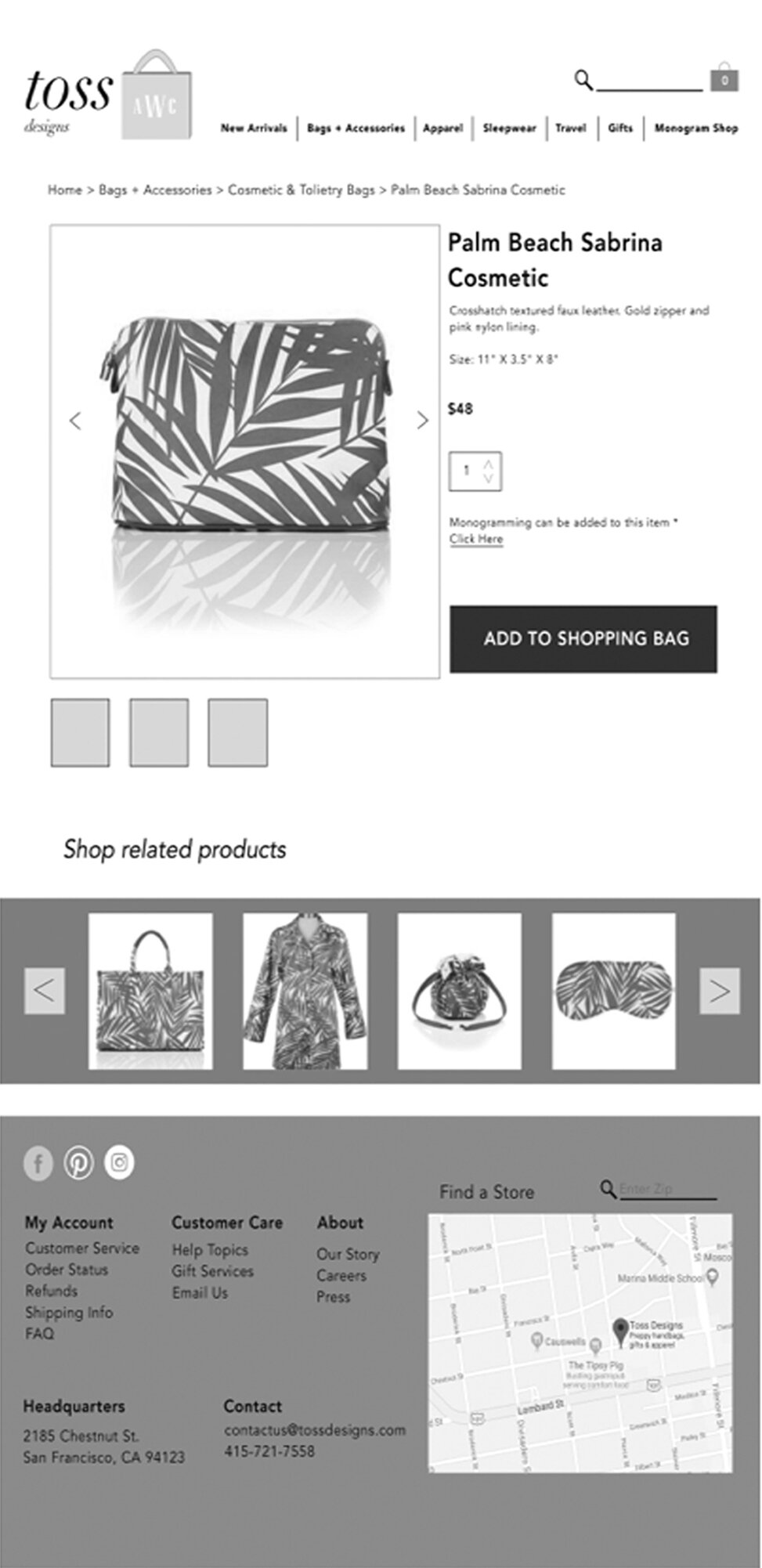
Lo-Fi Wireframes
Created lo-fi wireframes based on the initial hand sketches that were created based on competitor research, e-commerce best practices, and user research.
Homepage
Product Page
Checkout Page
Mid-Fi Wireframes
Several rounds of user testing was done, each time with a slightly more elevated version of a mid-fi fidelity wireframe in order to gain more insights before building the final version of the site.
Homepage
Checkout Page
Product Page
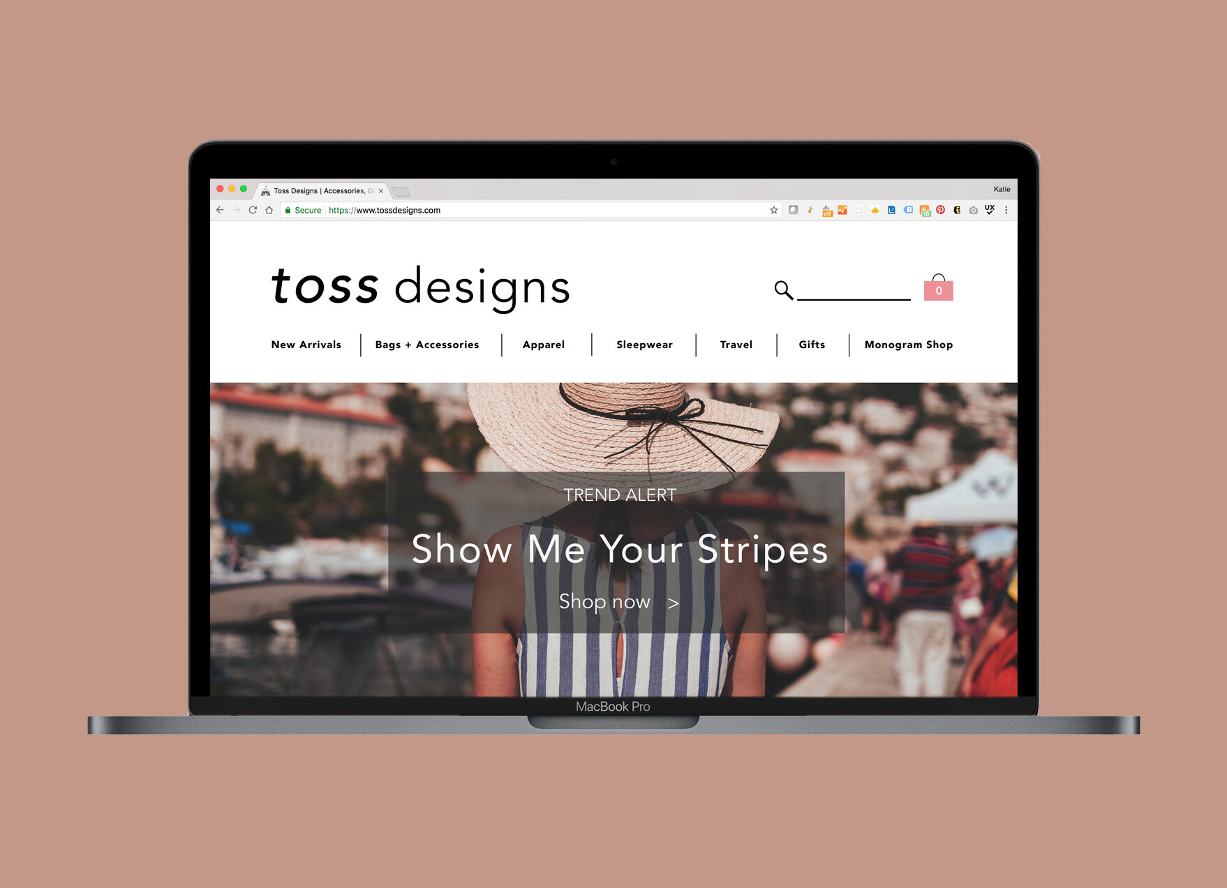
Final Design
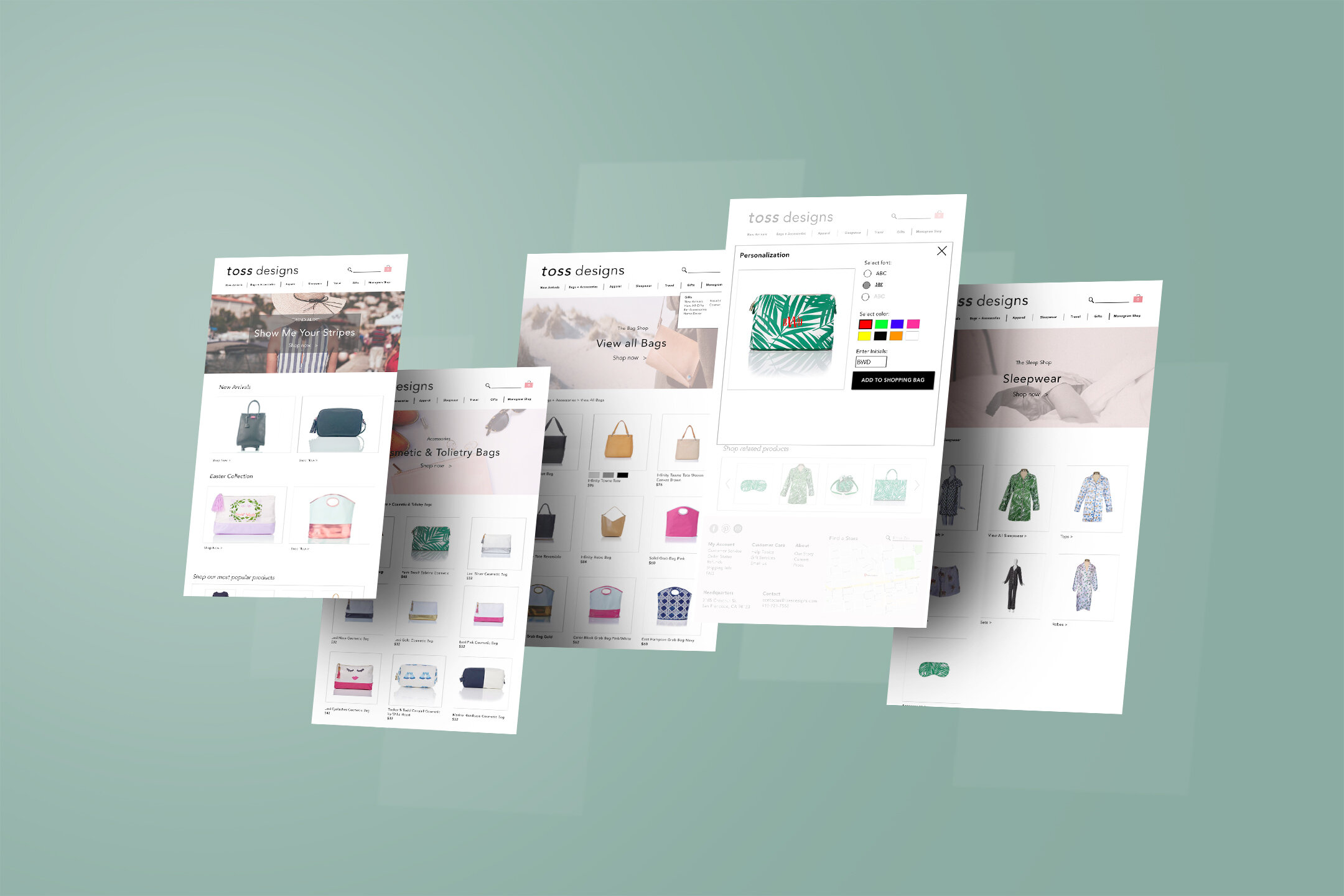
Homepage
It all begins with an idea. Maybe you want to launch a business. Maybe you want to turn a hobby into something more. Or maybe you have a creative project to share with the world. Whatever it is, the way you tell your story online can make all the difference.
Monogram Pop-Up Page
It all begins with an idea. Maybe you want to launch a business. Maybe you want to turn a hobby into something more. Or maybe you have a creative project to share with the world. Whatever it is, the way you tell your story online can make all the difference.
Category Page
It all begins with an idea. Maybe you want to launch a business. Maybe you want to turn a hobby into something more. Or maybe you have a creative project to share with the world. Whatever it is, the way you tell your story online can make all the difference.
